Webex Brand + Assistant

Overview
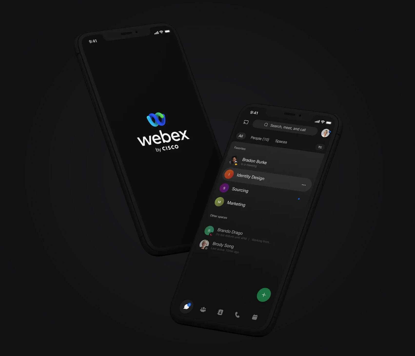
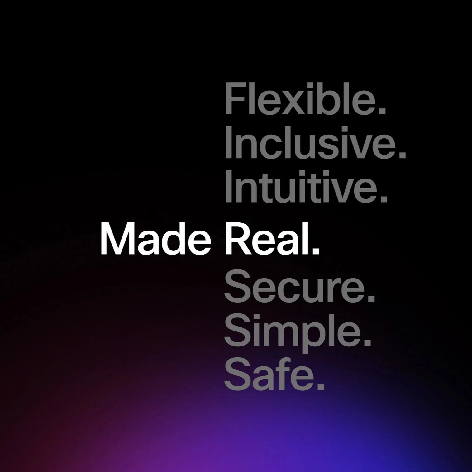
A brand refresh for Webex introduced a new illustration style, animations, and AI-powered chatbot integration to streamline in-meeting tasks such as note-taking and adding colleagues.
Skill
Brand Design, Product Design, Visual Design, UX Design, Motion Design
Product
App integrations and brand design
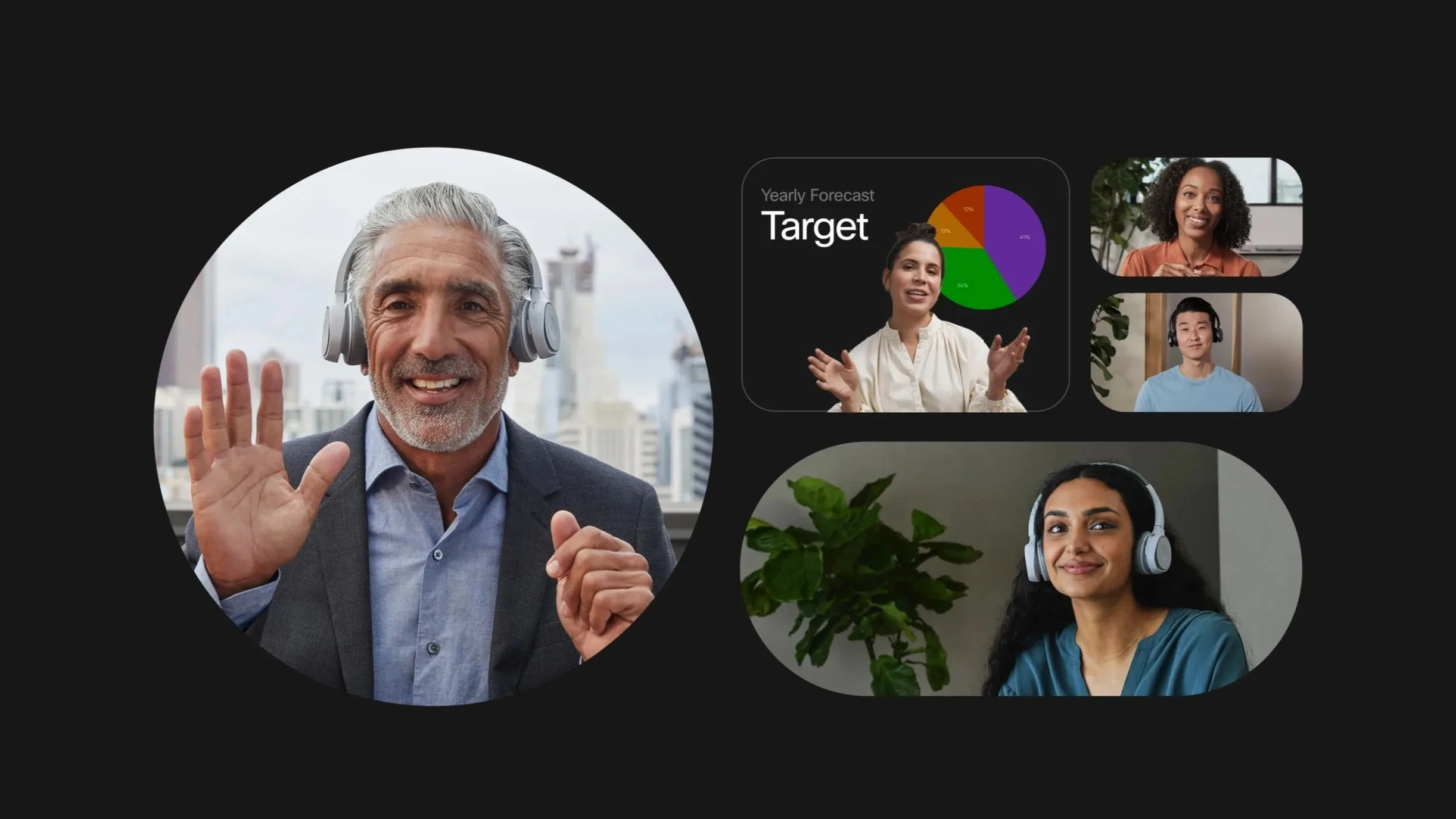
Remote collaboration in hybrid work
Remote collaboration and hybrid work are becoming permanent features of the modern work environment. Webex needed to evolve its solutions to make remote work more seamless and natural, ensuring users stay connected and productive. The blue and green rotating helix in the Webex logo symbolizes the harmonious flow of ideas when people come together.
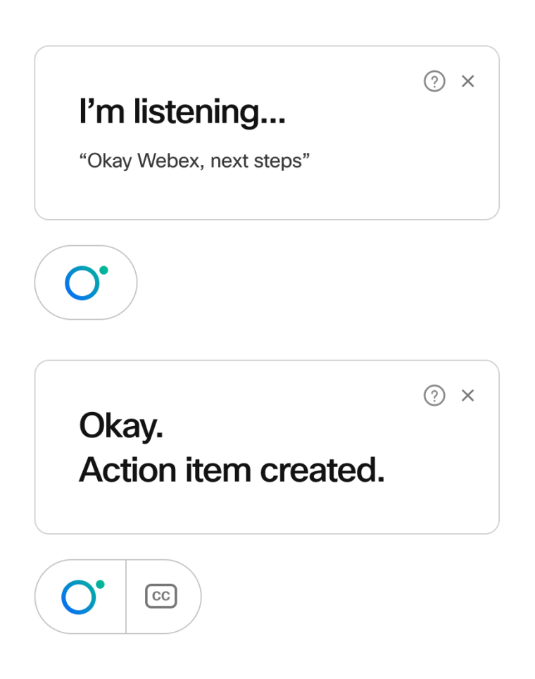
Our team lead the revamp of the Webex brand, illustration style, and animations. Additionally, I lead the design of an AI-powered Webex Assistant to streamline in-meeting tasks, like note-taking and adding colleagues on the spot. The Webex Assistant evolved from a robot character to an abstract, expressive system, retaining the helpful qualities of the original design while integrating with the new Webex visual language.


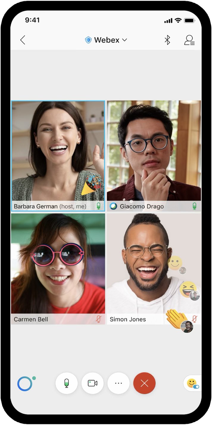
Webex Assistant
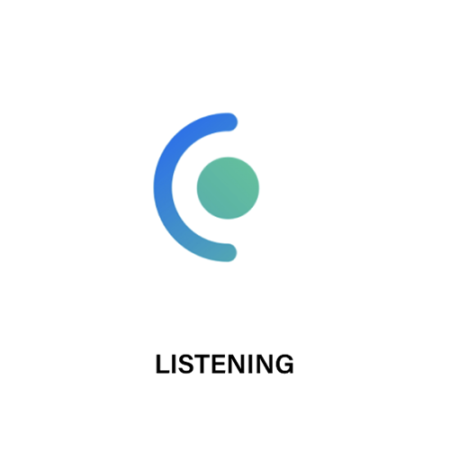
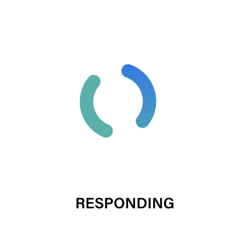
We evolved Webex Assistant from an anthropomorphic robot character to an abstract state, which retains the characteristics of an helper and brings to life its capabilities. To maintain cohesiveness with the design system, the design utilizes the dot and ring from the Webex word-mark animation, while retaining a fun and friendly personality.
The ring symbolizes 360-degree communication and the connections that Webex enables. The dot manifests as an exponent to the ring, augmenting the potential and ease of collaboration. With a few simple modes, Webex Assistant expresses itself and solves problems.